In the Year 2000
Designing Responsive Emails
Follow Along
Who am I?

Who was I?
Then
I hated it
So I taught myself to code.
SUCCESS
Yup!
Here we go!
First Assignment
Oh crap
Fortunately
My Story:
Emails are evil
Design
Code
Resources
DESIGN
First Things First
Pretty!
Takeaways
- Text Light
- Image Heavy
- Logo
- Max Width
Disclaimer
May not work for everyone
A/B Test the hell out of your emails
Assessment
What am I working with?

Planning
What am I making?
Goals
- Consistency
- Brand Awareness
To Make or Not to Make

There are a LOT of pre-made template options...
... which I didn't use.

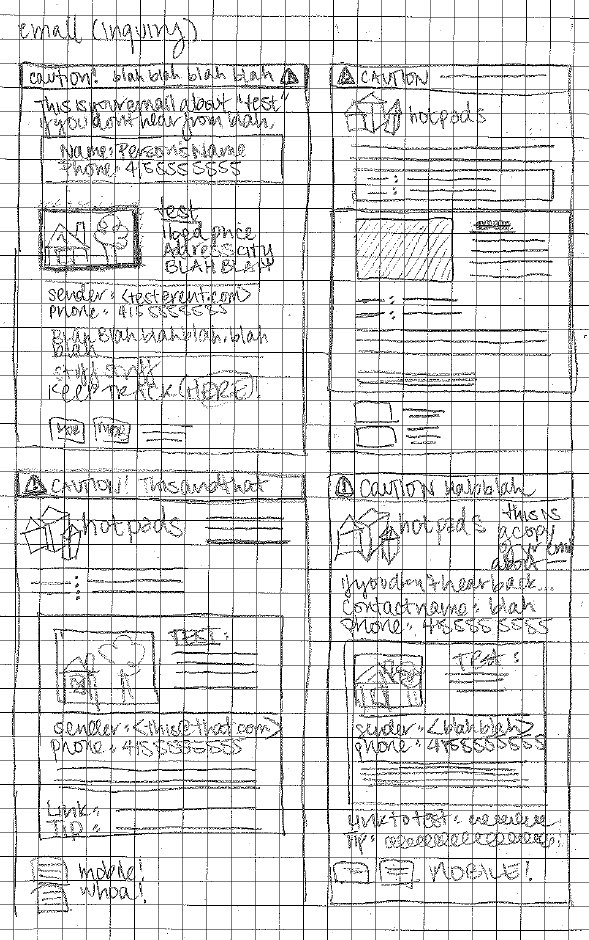
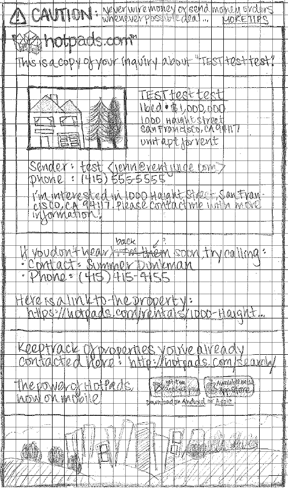
Sketching
Photoshop

Rule of Thumbs
Minimum Touchable Area
44px by 44px
WRONG!
44px by 44px

For the New Millenium
CODE
Tips and Tricks
Things I Learned Before I Started
Tables
MDN says:
"Note: Prior to the creation of CSS, HTML <table> elements were often used as a method for page layout. This usage has been discouraged since HTML 4, and the <table> element should not be used for layout purposes."
Emails say:
"LOL"
Tables
Are Important
No wrapper <table> makes code disappear in Apple Mail and Outlook 2011
Tables
do not display as inline or block

Tables
Default to display:table;
Chrome ignores max-width in that case
Set tables to display:block;
Inline Styles
You Need Them
Gmail doesn't support <style> in <head>
Outlook.com doesn't support link in <head>
Many clients don't support a whole bevy of CSS!
Campaign Monitor CSS
Inline Styles
You will, unfortunately, be doing a lot of this:
        From: ${userName}
        <${userEmail}>
Max Width
Max Width
550 - 600px
<%--Wrapper Table Begin--%>


<%--Wrapper Table End--%>
A Note About Comments
Tables all the way down.

Image Alternatives
Always have alt=" " or a background color.
This is also great for accessibility!

or

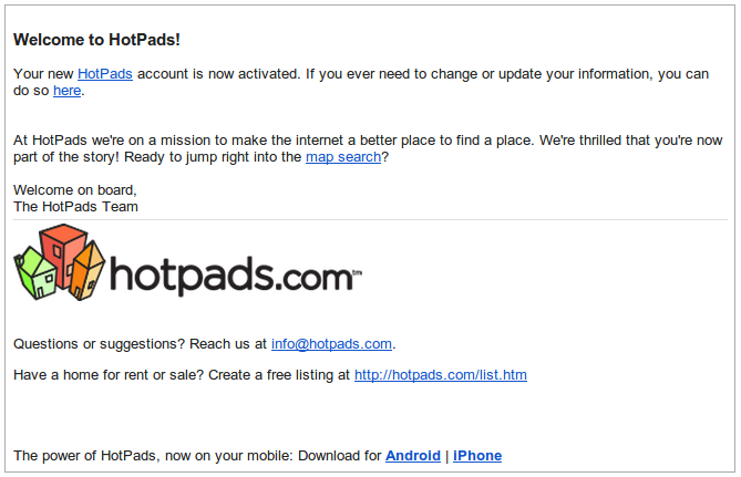
My Template!
It's on Github
Why Template?
Things I Learned While Coding
Media Queries
Readability or Device Targetting
@media only screen and (min-device-width: 768px) and
  (max-device-width: 1024px) {
    .background-table {
      max-width: 600px;
    }
  }
Note: media queries don't work on all clients.
Media Queries
Cover Your Bases
Use in conjunction with fluid layouts (% based widths)
@media only screen and (max-width: 480px), (max-device-width: 480px) {
  .background-table {
    max-width: 480px;
  }
}
AND
Device Pixel Ratio
"The device pixel ratio is the ratio between logical pixels and physical pixels."
From Stack Overflow
Device Pixel Ratio
Target retina or high res devices
@media  all and (min-device-pixel-ratio : 1.5),
     all and (-webkit-min-device-pixel-ratio: 1.5) {
      // Retina device styles go here!
    }
!important
When to use?
Use !important
Sometimes inline styles overwrite media queries...
@media only screen and (max-width: 480px), (max-device-width: 480px) {
  .headerBar {
    height: 5px !important;
    line-height: 5px !important;
  }
}
Blah blah blah
Line Height

Solution
Set a line-height on the surrounding <td>
Things I Learned After Release
Oops
<Img> Within <a>

Super weird and only occurs occasionally.

OR
High Res Images for Retina

The Problem
Outlook 2007, 2010, 2013, and Outlook in IE disallow HTML/CSS image sizing.
The Solution
- Set a background-image on the surrounding <td>
- Assign display: none; on the <img>
@media all and (min-device-pixel-ratio : 1.5),
  all and (-webkit-min-device-pixel-ratio: 1.5) {

  td[class="cautionBar"] {
    background-image: url('http://filenet.hotpads.com/images/email/warning.png');
    background-position: center;
    background-size: 30px 30px;
    background-repeat: no-repeat;
    width: 30px; !important;
    height: 30px; !important;
  }

  td[class="cautionBar"] img {
    display: none;
  }

}

Outlook 2007, 2010, & 2013
ignore max-width.
Max Width Bypass
.background-table {
  margin: 0;
  padding: 0;
  width: 100% !important;
  line-height: 100% !important;
}

@media only screen and (min-device-width: 768px) and (max-device-width: 1024px) {
  .background-table {
    width: 600px;
  }
}
Outlook 2007, 2010, & 2013

WTF?
Rendering Engines
- Outlook 2000 - 2003: Internet Explorer
- Outlook 2007, 2010, 2013: Microsoft Word
- Outlook 2011, "Outlook for Mac": WebKit
Gmail
Ignores <a> color styles in the <head>.
You have to style each and every <a> inline.

AOL & Outlook.com
Outlook.com prefixes with .ExternalClass
AOL prefixes with .aolReplacedBody
Outlook.com: add the prefix yourself
AOL: .aolReplacedBody .aolReplacedBody (targets nothing).
AOL Unicode Classes
Support class="★" but not id="★"
.★:not(#★){
  /* AOL styles */
}
Unfortunately
So do Android Mail and Outlook.com in IE
Targetting AOL only is probably not possible.
Yahoo! (Argh!)
Strips overflow-x property
Strips !important
Strips display: none inline, but not in <style>
WebKit
WebKit and Opera don't mask on border-radius
WebKit
Positioned elements don't clip contents to border-radius.
Intermediate div removes the border-radius and overflow: hidden from css positioning.
.parent {
width: 300px;
height: 300px;
position: absolute;
}
.intermediate {
border-radius: 10px;
overflow: hidden;
}
.child {
width: 300px;
height: 300px;
}
Ch-ch-ch-changes
Android Gmail enables forms prior to version 5.0.
Android Gmail disables forms as of version 5.0.
Android Email supports forms.