Tonight We're Gonna Code Like It's 1999
Creating Responsive Emails
Follow Along
Who am I?
Who was I?

Civil Engineer
Then I Was

"Community Specialist" at "Startup"
Read: customer support.
I hated it
So I taught myself to code.
SUCCESS
I landed my first job as a Web Developer!
Yup!
Here we go
First Assignment
Redesign emails and make them mobile-friendly.
Oh crap

Fortunately

My Story
Emails are evil.
- Design
- Research
- Assessment
- Planning
- Code
- Things I Learned Before
- Things I Learned During
- Things I Learned After
- Resources
- Blogs
- Templates
- Testing
DESIGN
First Things First
Research!
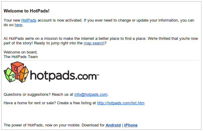
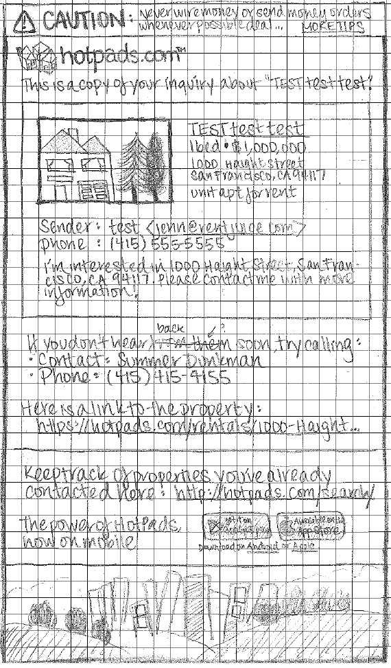
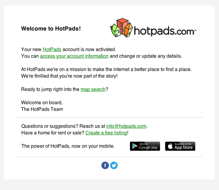
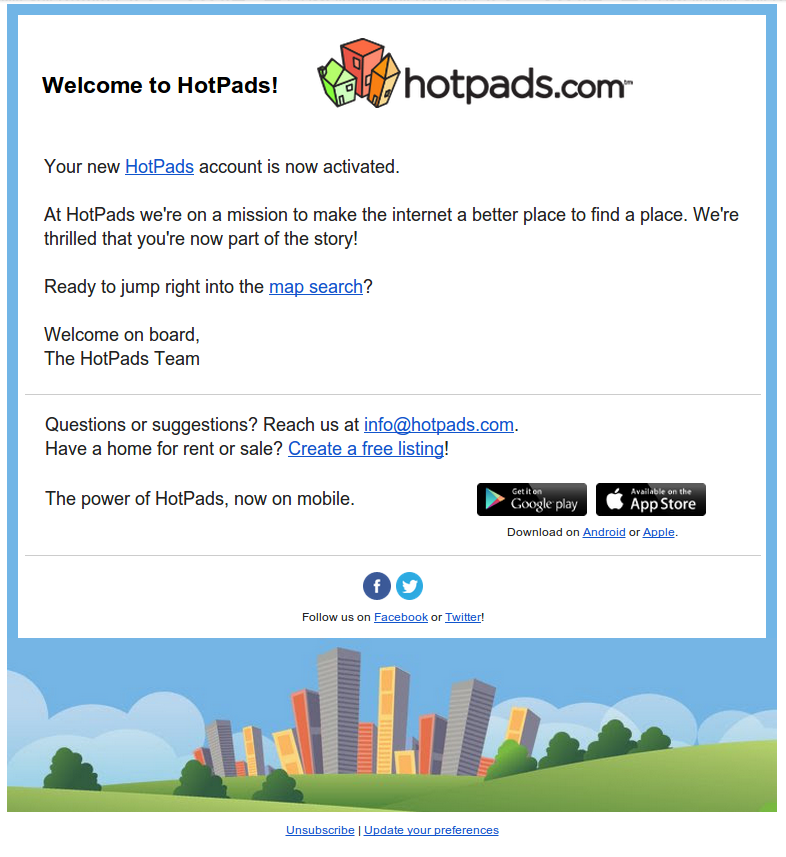
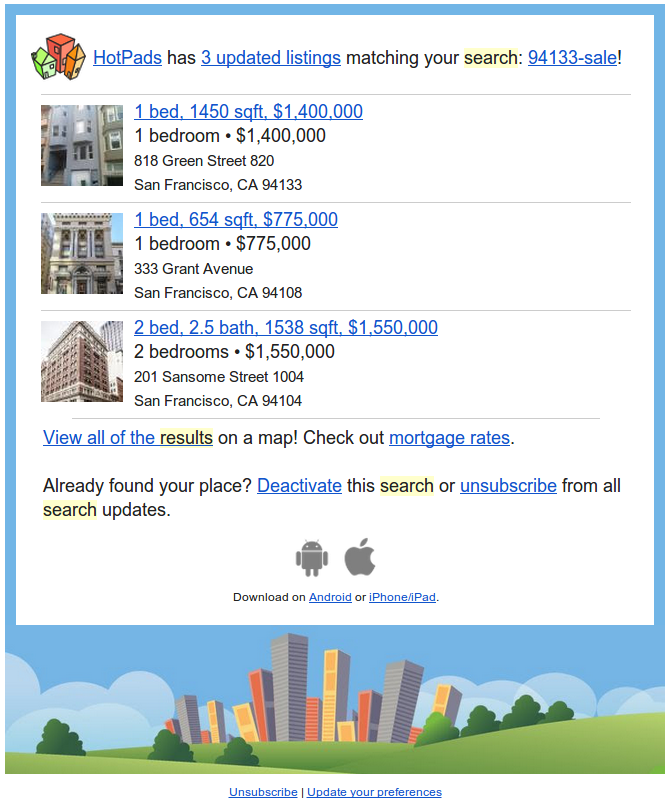
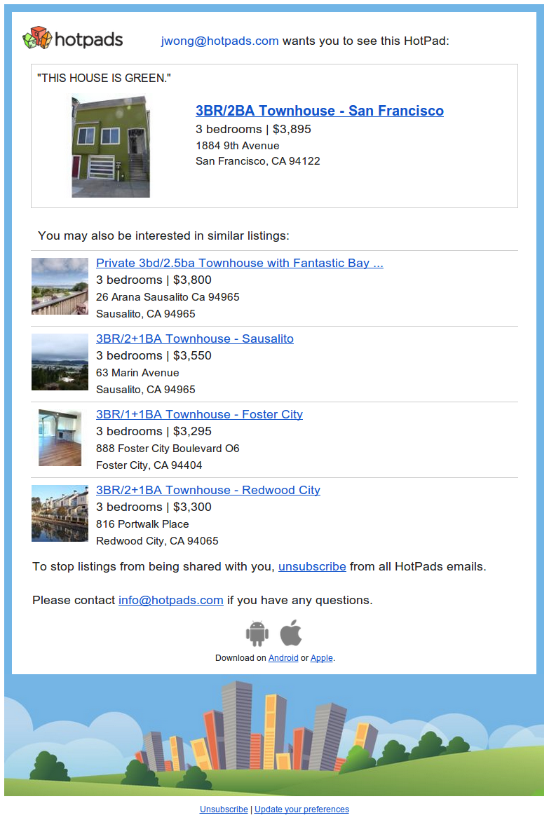
The first victim was our Welcome email.
Naturally, I researched other Welcome emails.
Most ಠ_ಠ
Most Favoritest
I know, I know, these are not welcome emails.
But they're just so pretty!
Takeaways
- Text (or not)
- Images
- Logo!
- Max width
Disclaimer
May not work for everyone
A/B Test the hell out of your emails
Assessment
What am I working with?
OMG
Wow
Planning
What am I making?
Goals
- Consistency
- Brand Awareness
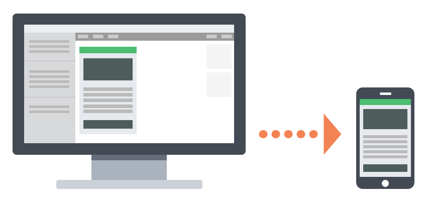
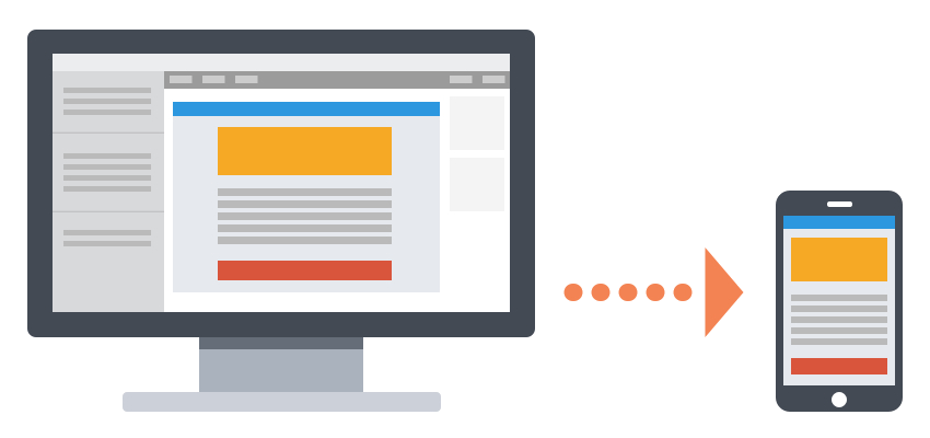
Responsiveness
- Scalable
- Fluid
- Responsive
Litmus Article
Scalable
Testing the mobile waters
Reliable rendering across clients and devices
Teams with limited resources
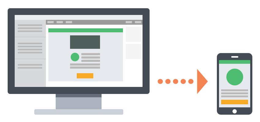
Fluid or Liquid
Simple layouts
Emails with mostly text that can flow
Teams with limited resources
Responsive
Large mobile audiences
The most control over layout
Teams with knowledge of media queries
Combo
We used them all.
Pre-Made Templates

There are a LOT of options...
which I'll mention a bit later
... and which I didn't use.

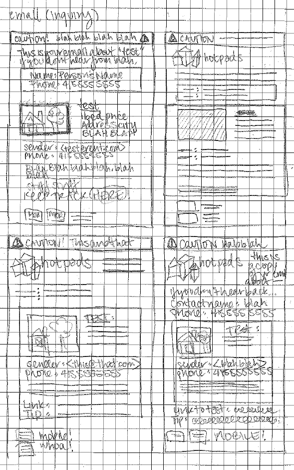
Sketching
Photoshop
Images
Rule of Thumbs
Minimum Touchable Area
44px by 44px
WRONG!
Aesthetic Prince Would Approve of

Just for Reference
CODE
Tips and Tricks
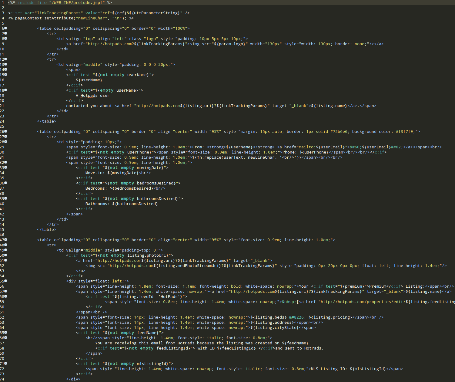
Java Templates: A Brief Note
Velocity vs JavaServer Page (JSP)

Things I Learned Before I Started
Tables

are coming.
MDN says:
"Note: Prior to the creation of CSS, HTML <table> elements were often used as a method for page layout. This usage has been discouraged since HTML 4, and the <table> element should not be used for layout purposes."
Emails say
"LOL"
Tables
Are Important
Not adding an outer <table> makes your code disappear in Apple Mail and Outlook 2011
Tables
do not display as inline or block

<table> default is display:table;
Use display:block; or Chrome will ignore max-width!
Inline Styles
You Need Them
Gmail doesn't support <style> in <head>
Outlook.com doesn't support link in <head>
Many clients don't support a whole bevy of CSS!
See Campaign Monitor CSS page.
Inline Styles
You will, unfortunately, be doing a lot of this:
        From: ${userName}
        <${userEmail}>
Max Width
Max Width
550 - 600px
<%--Wrapper Table Begin--%>


<%--Wrapper Table End--%>
A Note About Comments
Tables all the way down.
Image Alternatives
Always have alt=" " or a background color.
This is also great for accessibility!

or

My Template
Check it out on Github
Why Template?
Things I Learned While Coding
Media Queries
Awesome for readability or targetting devices!
@media only screen and (min-device-width: 768px) and
  (max-device-width: 1024px) {
    #backgroundTable {
      max-width: 600px;
    }
  }
Note: Media queries don't work on all clients.
Media Queries
Target Apple devices with 480px
@media only screen and (max-width: 480px),
  (max-device-width: 480px) {
    // Small screen styles here
  }
Media Queries
Cover Your Bases
Use in conjunction with fluid layouts (% based widths)
@media only screen and (max-width: 480px), (max-device-width: 480px) {
  #backgroundTable {
    max-width: 480px;
    font-size: 18px;
    margin: 0px;
  }
}
AND
Device Pixel Ratio
"The device pixel ratio is the ratio between logical pixels and physical pixels."
From Stack Overflow
Device Pixel Ratio
Target retina or high res devices
@media  all and (min-device-pixel-ratio : 1.5),
     all and (-webkit-min-device-pixel-ratio: 1.5) {
      // Retina device styles go here!
    }
!important
When to use?
Use !important
Sometimes inline styles overwrite media queries...
@media only screen and (max-width: 480px), (max-device-width: 480px) {
  .headerBar {
    height: 5px !important;
    line-height: 5px !important;
  }
}
Blah blah blah
Line Height

Solution
Set a line-height on the surrounding <td>
Things I Learned After Release
Oops
<Img> Within <a>

Super weird and only occurs occasionally.

VS.
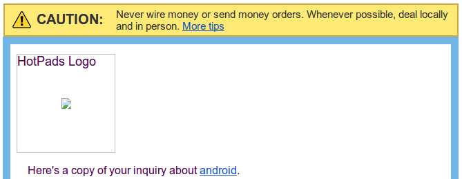
High Res Images for Retina

The Problem
Outlook 2007, 2010, 2013, and Outlook in IE don't allow HTML or CSS image sizing. Argh.
The Solution
Replace <img> by setting a background-image style on the surrounding <td> and assigning display: none; on the <img>.
@media all and (min-device-pixel-ratio : 1.5),
  all and (-webkit-min-device-pixel-ratio: 1.5) {

  td[class="cautionBar"] {
    background-image: url('http://filenet.hotpads.com/images/email/warning.png');
    background-position: center;
    background-size: 30px 30px;
    background-repeat: no-repeat;
    width: 30px; !important;
    height: 30px; !important;
  }

  td[class="cautionBar"] img {
    display: none;
  }

}

Outlook 2007, 2010, & 2013
ignore max-width.
Max Width Bypass
#backgroundTable {
  margin: 0;
  padding: 0;
  width: 100% !important;
  line-height: 100% !important;
}

@media only screen and (min-device-width: 768px) and (max-device-width: 1024px) {
  #backgroundTable {
    width: 600px;
  }
}
Outlook 2007, 2010, & 2013

WTF?
Rendering Engines
- Outlook 2000 - 2003: Internet Explorer
- Outlook 2007, 2010, 2013: Microsoft Word
- Outlook 2011, "Outlook for Mac": WebKit
Gmail
Ignores <a> color styles in the <head>.
You have to style each and every <a> inline.